Get in touch
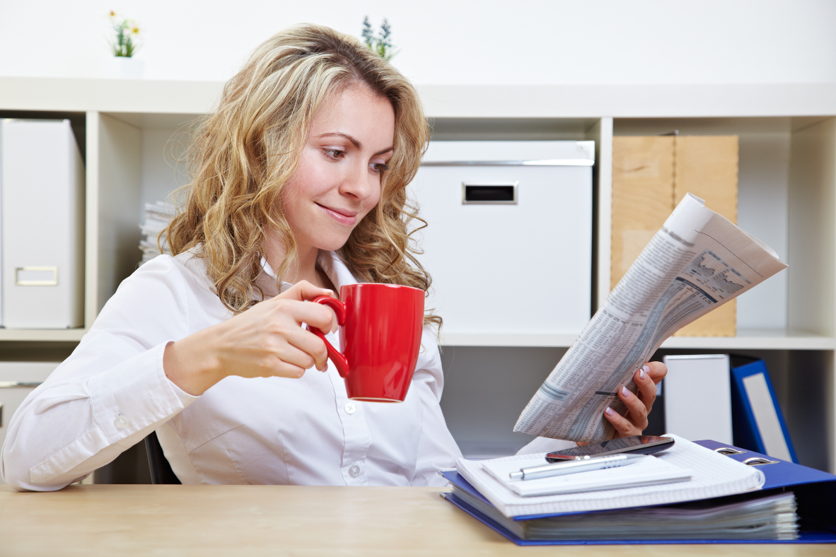
How to Design Your Newspaper
Good newspaper design, like small children, should be seen but not heard. That is, the reader should not be all that aware of the particular style elements behind the newspaper he or she loves reading so much.
The design which, by the way, is every bit as important as the news stories and photos it accommodates, at its best, quietly entices and skillfully takes the reader by the hand, leading him or her through the pages of the newspaper or its associated website.
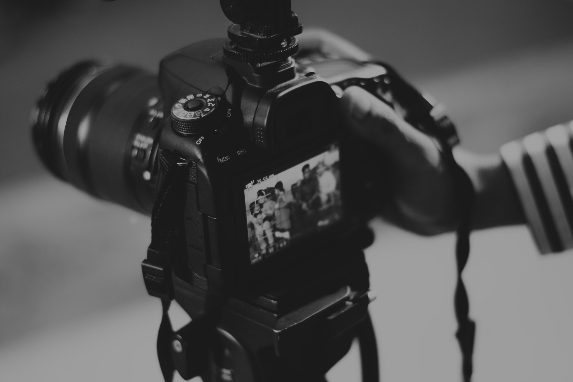
In these two videos/audio interviews and compendium white paper, learn the principles of great newspaper design from two well-respected newspaper professionals.
Shelley Ackerman is an award-winning newspaper and magazine designer – tabloid, broadsheet, weeklies and dailies. She is the art director of the twice-annual Whistler Magazine, the quarterly Coast Life Magazine, and the six-times-a-year Living Magazine. She has also acted as managing editor on several publications.
Devin Slater is the Design Director at the Globe and Mail. Devin has an accomplished track record in art direction, brand strategy, user experience and interface design, visual storytelling, advertising, marketing and social media promotions.
Section 1 VIDEO
Lecture 1 How to Design Your Newspaper? - Part 1
Lecture 2 How to Design Your Newspaper? - Part 2
Section 2 AUDIO
Lecture 3 How to Design Your Newspaper?
Section 3 WHITE PAPER
Lecture 4 How to Design Your Newspaper?
Section 4 TRANSCRIPTION
Lecture 5 How to Design Your Newspaper?
A GUIDE TO GREAT NEWSPAPER LAYOUT
Good newspaper design, like small children, should be seen but not heard. That is, the reader should not be all that aware of the particular style elements behind the newspaper he or she loves reading so much.
The design which, by the way, is every bit as important as the news stories and photos it accommodates, at its best, quietly entices and skillfully takes the reader by the hand, leading him or her through the pages of the newspaper or its associated website.
The best newspaper design eschews flash in favour of simplicity, ensuring its sections are easy to navigate, with pages that are crisp and uncluttered in appearance.
Design has come a long way since the first newspaper appeared in Rome all the way back in 131 BC, when contents of the Acta Diurna (translation “Daily Public Records”) was carved on to stone or metal message boards and placed in localities like the Roman Forum for all to see. Those who wielded the chisels lived in a simpler time, and did not have to concern themselves with font sizes or graphic elements.
Over on this continent, many centuries later, the first ‘newspapers’ tended to resemble pamphlets or newsletters. These New England publications featured deep columns of text, few headlines, no photos. Terribly dull, gray stuff by today’s standards.
Really, it was not until the Industrial Revolution and the advent of the printing press that more traditional newspapers started appearing, using the grid style of arranging text. But, again, the visual look of the thing was of secondary concern.
How that has changed in the 20th Century. A crowded marketplace and technological advances have prompted editors to spruce up their publications with big and bold headlines, photographs and all sorts of innovative graphic elements that enhance storytelling, such as infographics, sidebars and pullout quotes.
Today most newspapers rely heavily on these visual and graphic elements, and the use of colour.
While they continue to embrace the grid system to arrange text, increasingly, they deploy modular design which helps neatly organize text and visuals in rectangular or square boxes, thereby distinguishing a given editorial ‘package’ from other things happening on the page. The rectangular modules are preferred because they promote eye movement and are less boring aesthetically, according to eye-tracking research done by the Poynter Institute.
And, of course, a veritable design revolution is taking place online with newspapers shifting their traditional design habits to experiment with navigation tools and the integration of social media elements (Share, Reader Comment) that opens possibilities for public participation.
Modern design has an expanded mandate. It must not merely inform and/or entertain but also guide readers through a publication, helping them find what they are looking for, but also letting them know which stories the editor considers most significant for them to read. Applying a focus to every page and prioritizing stories gives clues to the reader about what he should get to first, and afterward.
Shelley Ackerman, a respected Canadian freelance newspaper designer, challenges those working on design first and foremost to know their communities because “demographics means a lot.”
If it’s a retirement community, for example, a newspaper’s readability must be a priority. Or, if the publication serves a smaller community, “you want as many faces, as much community information that people can relate to.”
Design complexity, of course, will depend on practical do-ability – related to the size of a newspaper’s staff roster. Accordingly, Ackerman redesigned the Trail Times, in a way that kept things simple, and formatted.
[Insert Trail Times front page here]
Josh Awtry and Colin D. Smith in overhauling the 17,500-circulation Times-News in Twin Falls, Idaho, also tried to keep things simple. See a Before and After at http://www.timharrower.com/PDFs/redesign.pdf.
Tim Harrower and Julie M. Elman, also in the U.S., have written The Newspaper Designer’s Handbook, which may be worth surveying for redesign options. http:/
/www.timharrower.com/ndh.html.
Ackerman recommends that content should be key in any design-re imagination exercise.
It is about killing off no-longer-useful features and finding new ways to become relevant. A design always should be less about making the newspaper prettier and more about making it more compelling, more interesting to readers, she says.
“Think about features that can be added, to connect more to the local community. Think about new local columnists … or a monthly in-depth feature consisting of one or two-pages.” Photo features or Q and A’s that put the focus on members of the community are appealing. And, “always, as many shots of faces as you can have. People, people, people. So important.”
Ackerman says, too many newspapers carry out redesigns too often, sometimes upsetting their readers.
Unless there is a significant problem with the newspaper’s existing logo and typeface, a redesign is more helpful when it focuses instead on the newspaper’s organization, as in where do things go, what order are sections in and are they clearly differentiated?
“Are there lots of clues in each story to pull the reader in, like kickers, indexes, pull out quotes, logos, mug shots?”
In Ackerman’s experience, “we work out the print model first and then sometimes, not always, we adjust the website. I really prefer it when websites are consistent with the look of the paper so that you are using the same colours, typefaces and branding.”
Ackerman, who uses the design programs InDesign and Adobe Suite, is a strong advocate of “lock-to-baseline-grid,” to ensure copy gets lined up consistently across the various columns. She says, this is “crucial in keeping the content clean, organized and easy to follow.”
Ackerman also recommends laying out a newspaper with style sheets and master pages. “If you don’t know how to use them, learn, because they are absolutely necessary.”
Another must – libraries. “I put nothing on my master pages and everything that I can in libraries, that I can drag over to the page.”
Nested styles is terrifically handy. “For example, you can embed a character style into a paragraph style which really speeds up layout. So, if you are doing an events calendar and have all these listings and would like everything at the beginning of each event to be bolded, you can set up a nested style that will work.”
Ackerman says many layout people aren’t aware you can change column grids on individual pages so, for example, you can on a particular page, switch off a six-column grid to a five or a nine-column pattern. “You can have a skinny little column anywhere on the page … You can just change up your design on those pages and get a little more creative.”
Newspaper design is more art than science and often the best ideas are gleaned by scrutinizing techniques of those doing it well. Britain’s Guardian newspaper happens to be one of Ackerman’s favourites when it comes to design, and in 2014 the London-based paper was cited by the Orlando, Florida-based Society for News Design as being one of the World’s Best Designed Newspapers. The Guardian was among five publications selected from a field of 200.
[Insert Guardian front page here]
The judges’ picks were based on the following factors: a timeless design; a strong voice; a bold approach; an apparent hierarchy; a design that serves the readers; visuals that excite; good ideas; consistency; courage.
An assortment of recommendations from an assortment of sources on newspaper design spotlights several key tips for good design.
Generally, the best design has a minimalist character, with good use of white space, so that pages have a less cluttered look. White space creates a more casual feeling and promotes the appearance of organization and cleanliness. The use of shadows, 3D effects and bevels, once popular, no longer are widely used.
Colours should be incorporated judiciously, again for the sake of cleanliness, and should be lightened as they print darker than what appears on a computer screen.
Choose easy-on-the-eye fonts and stick with a limited number of them throughout the publication. Times new Roman and Arial fonts, for example, are considered extremely readable. Serif and Sans serif fonts are preferred to script fonts. Text should generally be 11 to 12 pt.
https://signalvnoise.com/posts/140-the-10-most-popular-newspaper-typefaces
When a photo must be made smaller to fit, cropping — allowing for a zoom-in on a key part of the photo — is far better than shrinking or minimizing.
Alignment is important to keeping pages looking clean and promoting visual balance and symmetry. Columns should be the same width and aligned at the top or bottom. Pictures should be aligned to each other whenever possible. Spacing should be aligned so there is the same amount of space on left of the text as on the right.
As newspapers continue to evolve, the trend line in design will likely be toward greater clarity of expression, making the product ever easier to consume, going beyond text and using more creative visual elements to tell a story; providing more opportunity for readers to become involved. Newspapers are looking ever more pristine and well organized. And inviting.
And with the move online, expect more experimentation with story presentation and interactivity, as well as greater linkages with social media. Podcasts and webinars and YouTube hits will be accessed through publications that may begin to look less and less like your father’s daily newspaper.
Recapping, points to consider before redesigning:
- Who is the target reader (age, gender etc.)?
- What other publications do they read, and what do they like about those?
- What the five priority changes that would improve your newspaper’s success? (If a redesign is not among them, reorient your focus.)
- What impact would a redesign have on your staff, your advertisers, your readers?
- Is there a budget for a freelancer? If so, what performance indicators would you set to determine his/her success?